ARTICLES
The story of the creation of the Rolling Stones’ tongue logo
One of the most famous band logos in the history of Rock and Roll music, The Rolling Stones red tongue was created by John Pasche that was master at the Royal College of Art, London.

In an interview with the New York Times, Pasche revealed that the first draft was immediately declined, but the second was a success for the Rolling Stones. “(They wanted me) To create a logo or symbol which may be used on note paper, as a programme cover. Also as a cover for the press book.”
Second Rolling Stones logo version
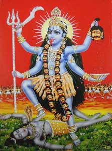
The second and final version, harked back to the aesthetics of the ’30s and ’40s. But also included a Concorde turbojet, was more pleasing. In a meeting with Mick Jagger some months later. He was asked to make “an image that could work on its own. Like the Shell Petroleum logo. He wanted that kind of simplicity.” And Jagger showed the artist an illustration of the Hindu deity Kali. Which Jagger had seen in a shop near his home and asked if he could borrow.
He said Jagger was “more interested in the Indian nature of it. I just immediately picked up on the tongue and mouth”. Contrary to popular belief, the logo, originally created in black and white and used to create subsequent versions, was not, at least intentionally intended to represent Jagger’s tongue and lips.
The Stones liked the logo so much that instead of the £ 50 initially combined, they added £ 200 in Pasche’s payment. According to the band, the logo would represent “the band’s anti-authoritarian attitude, Mick Jagger’s mouth and the obvious sexual connotations”. However, Pasche has already revealed that the images were unconscious. And the design was done with a single objective: to look beautiful in goods.


